

Timeframe in Trading: Which One to Choose for Cryptocurrency Trading
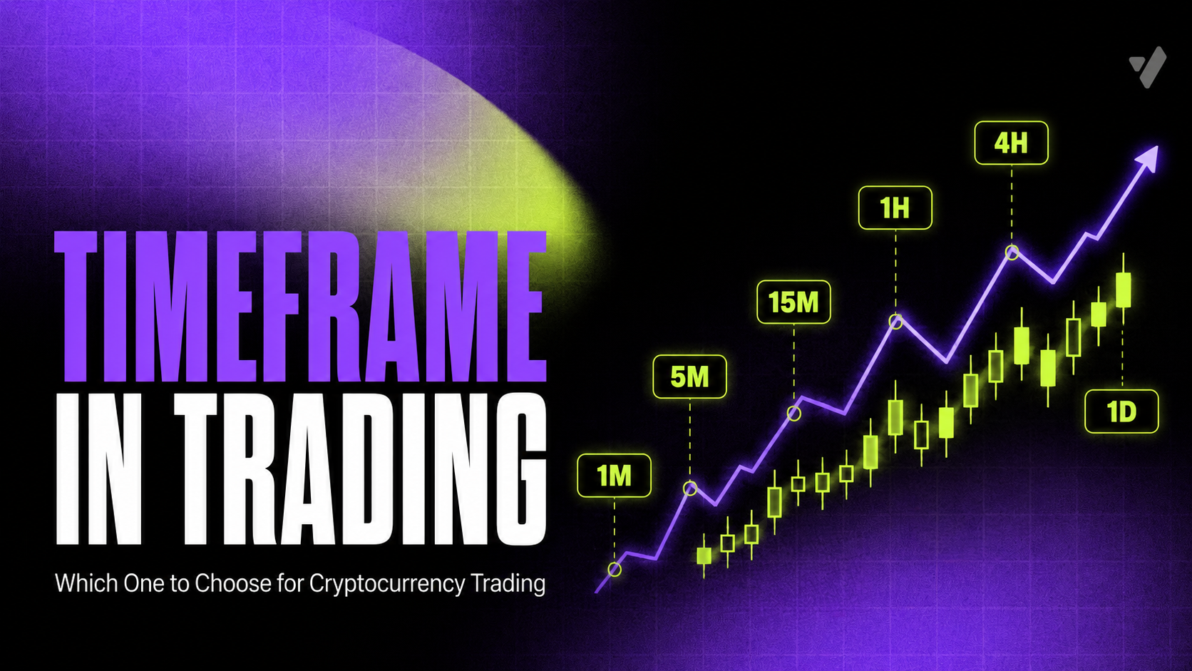
A timeframe is the time interval of one candle on a chart. M5 shows price movement over five minutes, H1 over one hour, and D1 over one day.
Lower timeframes provide more detail and more trading situations, but they also reflect more short-term noise. Higher timeframes show a larger structure, but new candles and signals form much less frequently.
There is no universal “best timeframe.” The interval is chosen according to the analysis horizon and the specific task. In a multi-timeframe approach, the higher chart is used to understand the context, the working chart is used to analyze the setup, and the lower chart is used to study the movement in more detail.
Table of Contents
- What Is a Timeframe?
- Why the Same Asset Looks Different on Different Timeframes
- What Types of Timeframes Exist?
- What Changes When the Timeframe Is Reduced?
- Market Noise and Timeframe
- How Timeframe Is Connected to Trading Style
- How to Choose a Timeframe
- Timeframe Table for Cryptocurrencies
- What Is Multi-Timeframe Analysis?
- Example of Multi-Timeframe Analysis
- How Many Timeframes to Use at the Same Time
- Why You Cannot Simply Choose the Highest Timeframe
- Why You Cannot Analyze Only M1
- Timeframe and the 24/7 Cryptocurrency Market
- Common Mistakes When Choosing a Timeframe
- How to Organize Timeframe Analysis
- Which Timeframe Is Better?
- Disclaimer
What Is a Timeframe?
Timeframe translates as “time interval.”
On a candlestick chart, a timeframe shows what period of time one candle contains.
For example:
- M1 — 1 minute;
- M5 — 5 minutes;
- M15 — 15 minutes;
- M30 — 30 minutes;
- H1 — 1 hour;
- H4 — 4 hours;
- D1 — 1 day;
- W1 — 1 week.
Each candle contains four basic values: the opening price, high, low, and closing price for the selected period.
Therefore, the hourly BTC/USDT candle shows where the price was at the beginning of the hour, what high and low it reached, and where it ended up by the close of that hour.
If you switch the chart from H1 to M5, the trade history itself will not change. Only the way the data is grouped will change: one hour will be represented by twelve five-minute candles.
Why the Same Asset Looks Different on Different Timeframes
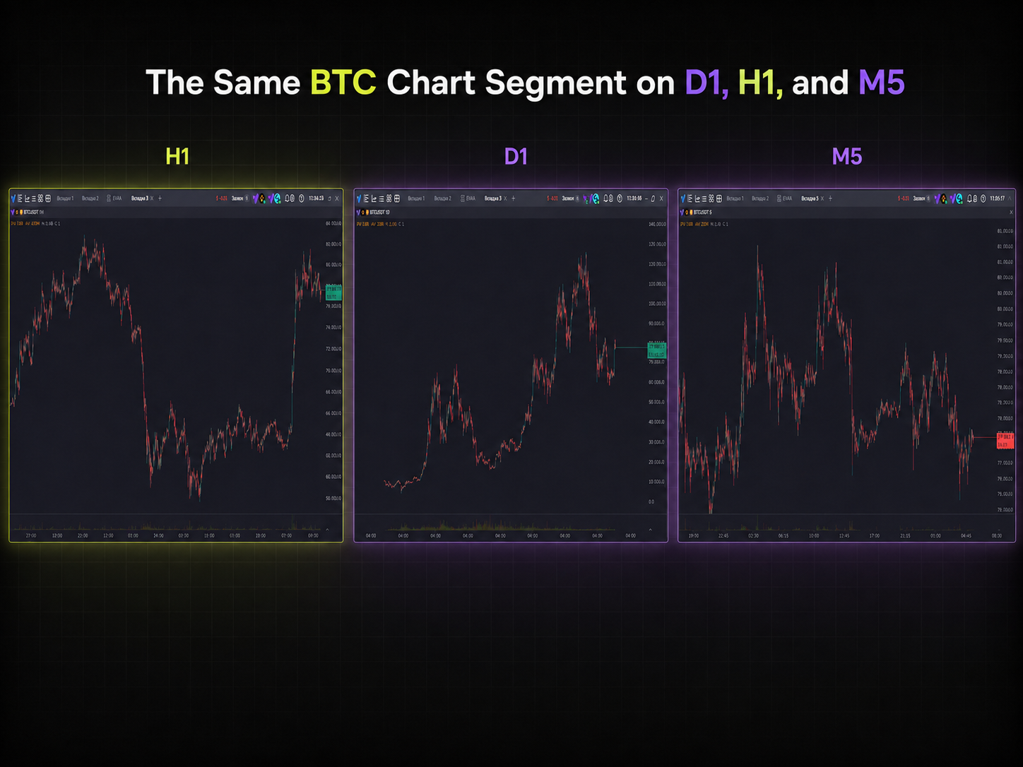
Suppose Bitcoin has been rising for several days.
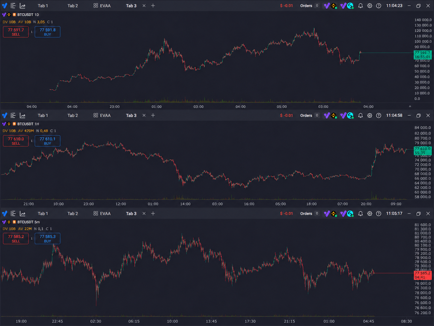
On D1, this may look like a stable upward movement. On H1, individual impulses and corrections will be visible inside it. On M5, one of these corrections may already look like a full-fledged local downtrend.
At the same time, all three charts show the same market.
This is an important principle: a trend is always connected to the selected time scale.
The phrase “BTC is in an uptrend” is incomplete without context. On the daily chart, the direction may remain upward while a decline is developing on the hourly chart, and a new local rise has already started on the five-minute chart.
What Types of Timeframes Exist?
For convenience, intervals can be conditionally divided into several groups.
| Group | Examples | What Is Seen Better |
|---|---|---|
| Very short | M1–M5 | Micro-movements, local liquidity |
| Intraday | M15–H1 | Movements within the day |
| Medium | H4–D1 | Larger impulses and corrections |
| Higher | D1–W1 and above | General market structure and cycles |
The boundaries are conditional. H1 may be a higher chart for a scalper, and a lower chart for a swing trader.
Therefore, the concepts of “higher” and “lower timeframe” are always relative.
If the working chart is H1, then H4 and D1 will be higher, while M15 and M5 will be lower.
What Changes When the Timeframe Is Reduced?
The main change is the amount of information.
Over one day, the following is formed:
- 1 D1 candle;
- 6 H4 candles;
- 24 H1 candles;
- 96 M15 candles;
- 288 M5 candles;
- 1440 M1 candles.
The smaller the interval, the more detailed the movement is displayed.
But additional detail does not always mean additional useful information.
On minute charts, individual market orders, short-term liquidity changes, small impulses, and random fluctuations are more noticeable. Because of this, levels may be broken and then regained several times within a short period of time.
On a higher chart, these movements are combined inside one candle and stop defining the overall structure.
Market Noise and Timeframe
Market noise usually means short-term fluctuations that do not change the larger direction.
For example, Bitcoin moves from 100,000 to 105,000, but inside this movement it declines by small amounts dozens of times.
On M1, each such change takes up a noticeable part of the chart. On H4, it may look like a small candle wick.
That is why the same technical pattern carries different context on different intervals.
This does not mean that lower timeframes are “wrong.” They simply answer a different question. M1 can be useful for analyzing short-term activity, but it is poorly suited for evaluating a movement that develops over several weeks.
How Timeframe Is Connected to Trading Style
The frequency of working with the chart is usually connected to the expected duration of the trading idea.
Scalping
In scalping, traders analyze short movements and market changes within a relatively small period of time.
Therefore, M1, M5, M15, and a higher chart for context may be used in the work.
On short intervals, liquidity, the order book, the flow of trades, spread, and fees are especially important. If the expected movement is small, trading costs take up a large share of the potential result.
Intraday Trading
Day trading involves analyzing movements that develop within the day.
M15, M30, or H1 may be used as working timeframes, while H4 is used for broader context.
The number of decisions is lower than when working on M1, but intraday fluctuations are still clearly visible.
Swing Trading
Here, movements lasting from several days to weeks are analyzed.
H4 and D1 are more often suitable for this: they allow traders to see larger impulses, levels, and corrections without constantly monitoring minute-by-minute fluctuations.
Foreign educational materials on swing trading also usually consider four-hour and daily charts as the main intervals for this approach.
How to Choose a Timeframe
Instead of searching for one “best” interval, it is more useful to answer several questions.
How Long Should the Analyzed Movement Develop?
If the movement of interest lasts several minutes, a daily candle will provide too little detail.
If the market structure over several months is being studied, a minute chart, on the contrary, will create a huge amount of unnecessary information.
The timeframe must correspond to the task horizon.
How Often Should Decisions Be Made?
On M1, new information appears every minute.
On H4, a fully formed new candle appears once every four hours.
Therefore, one style requires constant attention to the market, while another allows the situation to be analyzed much less frequently.
How Important Are Trading Costs?
In the cryptocurrency market, each operation may involve a fee, spread, and slippage.
With a large number of short trades, these expenses accumulate faster.
Therefore, it is incorrect to compare two timeframes only by the number of potential setups: the cost of execution must also be taken into account.
Which Tools Are Used?
The order book and time and sales are especially informative for short-term analysis.
Large horizontal levels and long-lasting trends are more convenient to study on higher charts.
Indicators also depend on the interval. For example, EMA 20 on M5 analyzes a completely different section of history than EMA 20 on D1.
Timeframe Table for Cryptocurrencies
| Timeframe | Detail | Frequency of New Data | Market Noise | Typical Task |
|---|---|---|---|---|
| M1 | Very high | Very high | Very high | Market microstructure |
| M5 | High | High | High | Short movements |
| M15 | High | High | Medium-high | Intraday context |
| H1 | Medium | Medium | Medium | Intraday structure |
| H4 | Medium-low | Low | Lower | Multi-day movements |
| D1 | Low | Very low | Significantly lower | Major trend |
| W1 | Very low | Minimal | Minimal | Market cycles |
This table does not define where it is “better to trade.” It shows what information is more convenient to receive at each scale.
What Is Multi-Timeframe Analysis?
Multi-Timeframe Analysis is the analysis of the same instrument on several time intervals at once.
Its point is not to open ten charts, but to separate tasks.
Usually, three levels are used:
higher timeframe → context;
working timeframe → structure of the trading situation;
lower timeframe → detail.
This top-down approach is common in technical analysis: a larger chart allows traders to see the main direction and key areas, while a shorter chart allows them to examine what is happening inside them.
Example of Multi-Timeframe Analysis
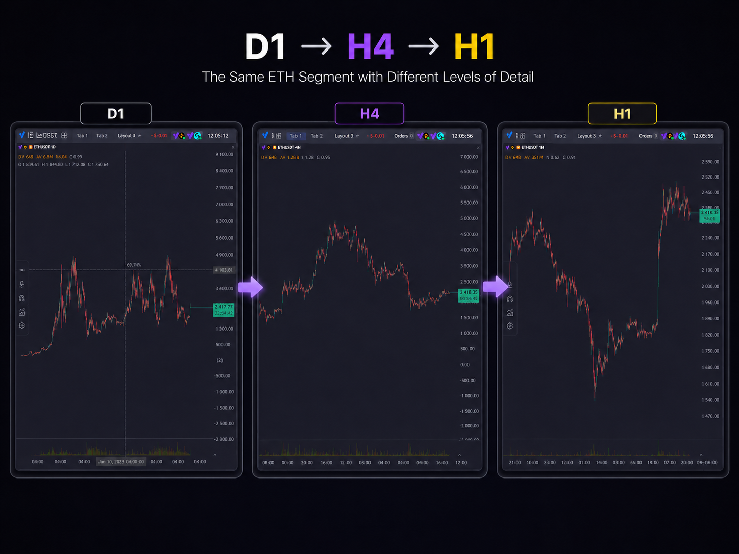
Suppose ETH/USDT is being analyzed.
On D1, the price maintains an upward structure and approaches a previously formed level.
On H4, it is visible that a correction is developing after the impulse.
On H1, it becomes noticeable how the price behaves directly near the area of interest.
In this case, each chart answers its own question:
| Timeframe | Question |
|---|---|
| D1 | Where is the market within the larger structure? |
| H4 | How is the current movement developing? |
| H1 | What is happening inside the selected zone? |
The main benefit of this approach is protection against a scale error.
A local rise on M15 may turn out to be only a small pullback inside a larger downward movement on D1.
How Many Timeframes to Use at the Same Time
More does not always mean better.
If you analyze M1, M5, M15, M30, H1, H2, H4, H8, D1, and W1 at the same time, you will almost always find signals that contradict each other.
This is natural, because each interval shows its own market scale.
For structured analysis, two or three connected charts are usually enough.
For example:
D1 → H4 → H1
or:
H4 → H1 → M15
or for shorter analysis:
H1 → M15 → M5
These are not ready-made trading settings, but examples of a logical separation of time scales.
Why You Cannot Simply Choose the Highest Timeframe
Higher intervals have less short-term noise, but they lose detail.
For example, a daily candle may show:
- opening at 100;
- high at 110;
- low at 95;
- closing at 108.
From it, it is impossible to understand the sequence of movement within the day.
Perhaps the price first fell to 95, then rose to 110. Or perhaps it first rose to 110 and only after that dropped sharply.
On M15, this structure will be visible.
Therefore, the higher chart shows the general picture better, but it does not replace the lower one when it is necessary to study the internal movement.
Why You Cannot Analyze Only M1
The opposite problem arises when the scale is increased too much.
On M1, almost all short-term fluctuations are visible, but it becomes more difficult to assess how important they are relative to the larger market.
A local breakout may look significant, although on H4 it is located directly inside a large range and practically does not change the structure.
In addition, on short charts, the frequency of indicator signals is higher. For example, foreign materials on technical indicators separately note that reducing the period and using short intervals usually increases sensitivity along with the amount of noise and false signals.
Timeframe and the 24/7 Cryptocurrency Market
Cryptocurrencies are traded around the clock and without the traditional exchange pause for the night.
Nevertheless, D1, H4, or H1 candles still have fixed boundaries.
Therefore, when comparing charts, it is important to take the platform’s time zone into account. A daily candle in one terminal may start at a different moment relative to the user’s local time, although the trades themselves in the market are the same.
For intraday analysis, this is especially important when evaluating the candle closing time.
Common Mistakes When Choosing a Timeframe
Searching for the “Most Profitable” Timeframe
A time interval only groups price data. By itself, it does not create an edge and does not determine the result.
Constantly Switching After an Unsuccessful Signal
If a trading idea is formed on H1, opening M1 after an unfavorable movement often leads not to additional analysis, but to searching for confirmation of the desired scenario.
It is better to define the role of each chart in advance.
Mixing Signals From Different Scales
For example, defining a monthly trend on D1 and then considering it canceled because of one movement on M5.
A signal should be evaluated on the scale on which it was formed.
Using Too Many Charts
The more timeframes are open, the easier it is to find both bullish and bearish arguments at the same time.
Ignoring Fees and Liquidity
A lower timeframe gives more potential operations, but a large number of operations means more trading costs.
How to Organize Timeframe Analysis
A practical scheme looks like this:
- Determine the horizon of the analyzed movement.
- Choose the working timeframe.
- Open one higher chart for context.
- If necessary, add one lower chart for detail.
- Mark levels on the timeframe where they were actually formed.
- Do not change the interval system inside the analysis without a reason.
- Test the approach on historical data or in training mode before evaluating its practical effectiveness.
Which Timeframe Is Better?
There is no universal answer.
M1 is not automatically worse than D1, and D1 is not better than H1. They solve different tasks.
A well-chosen timeframe corresponds to:
- the analysis horizon;
- the trading model;
- the available time;
- the required detail;
- the characteristics of the instrument;
- the acceptable frequency of decisions.
Therefore, it is more correct to ask not “which timeframe is the best?”, but “which time scale is needed for this specific task?”
It is this approach that helps avoid a situation where a trader tries to analyze a weekly trend on a minute chart or, conversely, search for an intraday structure using one daily candle.
A timeframe in trading is a time period that is combined into one candle on a chart. The smaller the interval, the more details and short-term noise there are. The larger it is, the more small movements are smoothed out and the better the overall structure is visible.
In the cryptocurrency market, there is no single optimal timeframe for all situations. Scalping, intraday analysis, and multi-day movements require different levels of detail.
Therefore, instead of searching for a universal value, it is more useful to distribute roles between several charts: the higher one shows context, the working one shows the current structure, and the lower one shows the movement details.
This way, the timeframe becomes not a setting chosen once, but a tool for changing the scale of the market.
Disclaimer
The material has been prepared exclusively for informational and educational purposes. It is not an individual investment, financial, trading, legal, or tax recommendation, an offer to buy, sell, or hold cryptocurrency or any other instrument, or a guarantee of any result.
Cryptocurrencies and related financial instruments are highly volatile assets and may change significantly in price, including falling to zero. Past results, including reaching all-time highs, do not guarantee the repetition of similar dynamics in the future. Any decisions are made by the user independently, and the user bears responsibility for the risks associated with them. Vataga Crypto is not responsible for financial decisions made on the basis of or using information from this material.
Before making a decision to start investing in cryptocurrency and/or related instruments, we strongly recommend consulting independent financial, tax, legal, and other advisors.